Winery Websites: Not So Good, it Seems
By Evan Dawson, Managing Editor
 When you visit a winery’s website, you’re probably there for one simple reason. Either you want tasting room hours or the wine list or the winemaker’s story. But whatever it is, you want it quickly and easily.
And too often, it’s not easy enough to find what you’re seeking. On top of that, the websites look clunky and amateurish. This is a generalization, of course. Some websites are excellent. Too many are not.
But don’t take it from me. Here’s an email I received this week from a reader of my book, Summer in a Glass. This reader lives several states away.
I’ve re-printed the email in full, and I welcome your thoughts on what makes for a high-quality and low-quality website.
*****
Hi Mr Dawson,First of all, thank you for writing this book. Though we currently live in Wisconsin, my wife and I are physicians originally from upstate NY. We’ve recently decided to move back to CNY (Canandaigua) to start our own adventure, and this book has made us proud and excited to move back!Like many, my wife and I made the rounds on various wineries websites after reading your book, and I wanted to comment on something I bet you’ve noticed, and could help with!Many of the websites are, well, a bit difficult to navigate. Like the vintners you describe, the websites are not flamboyant or ostentatious. That’s fine as a character trait, but perhaps not so good for marketing. Specifically, we noticed that many photos are casual (amateur?), and don’t do justice to the scenery or the establishment. I left some websites with an overall impression that I can’t get engaged with the wine or the winery.
That’s frustrating, and I’m sure a ton of folks are visiting those sites after or as they read your book, and I bet many others left the sites feeling a bit disappointed. For instance, if I decided to plan a trip to the Finger Lakes, I’d hit these websites hard to get organized. So in that scenario, I think the website design could become sort of crucial for the wineries, right?
We thought Weimer’s website was really good. The designer looks like he’s a computer science grad from Cornell (my alma mater). I was thinking that between your wife working as a professional photographer and perhaps with your mutual contacts in the web design/photography business, you could help link some of the wineries with eager folks to help improve the websites. I don’t know, I’m sure these wineries will do very well thanks to your book, but I felt compelled to contact you anyway!
You’ve almost single-handedly changed our opinion of CNY with this book….
THANK YOU!Sincerely,
(Name withheld - I’ve asked the author for permission to publish their name.)


Your reader didn’t even mention the many sites that have either outdated lists of events or no listings at all.
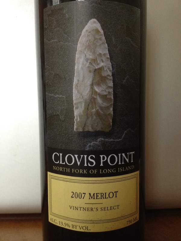
I’m also appalled at most of the Finger Lakes wine labels. With Ravines and Red Tail Ridge being the obvious exceptions, there are some heinous labels out there. A good part of the wine experience is marketing and packaging. There are quite a few bottles of wine from the Finger Lakes that I can’t even fathom tasting because I just cannot get beyond their horrible labels.
Evan, thanks for sharing this — and if you hear back from the person who emailed you to inspire the post, please thank him or her as well.
Websites and Internet marketing are what I do at my day job and I’ve lamented just how bad most wineries (not just in New York btw) are at it. The emergence of social media has both helped and hurt. Helped because at least they are engaging with customers more regularly but also hurt because the same limited resources now have to take on Twitter and Facebook as well.
There are so many reasons why winery websites are often underwhelming, but the one I hear most often is resources — wineries just don’t have the money to invest in a full-time web person or to pay someone to design and build a decent website in the first place.
And sadly, many of the wineries who do find money to pay agencies or designers get mediocre work back from their investment… with a bad experience to boot. So, it’s never a priority again. There are just so many bad agencies out there.
I care less about a websites design (the expensive part) than I do its content and utility (things that really only need to cost man hours). Wineries need to think about what 5-10 tasks 99% of their audience are looking to accomplish and build their site around that.
I could go on and on about this topic, but let me end with this — for most customers, your website is the first touchpoint for your winery’s brand. It should be a priority in your marketing plan.
Lenn - Well said. I’ve heard the complaints, but look at the good websites: You can’t coast on excuses. Poor websites cost you business, period. If customers can’t find what they’re looking for, or if customers think you look amateurish, you lose business.
Blair - Suffice to say, we at NYCR approve of your message on wine labels.
Laura - Great point. I can think of a half dozen winery websites offhand that have outdated event lists, for example, not to mention outdated wine lists.
Lenn has it exactly right with regards to the limited time/resource pool that small producers have to manage a digital infrastructure, let alone the real one, and I’ve also seen same kind of folks spend good money on professional help, that was simply not worth it. Truth is, it takes a certain amount o time, on top of teh cost, to manage an outside resource. Then of course there are the wineries that do have money, and pour it into a lovely looking but nearly useless Flash based site.
At least the broad acceptance of content management platforms like WordPress, means that there are ways that limited budgets can use off the shelf tools, to serve up a professional appearance.
WordPress + twenty minutes = Bang. Done.
Do you offer competitive rates, DragonFlyEye? Maybe you should get working…
A website is a winery storefront. To often they don’t look at it in that manner. I went to look at a local winery’s website for a price and they had nothing past 2000 and another says “access denied”. It’s most unfortunate when this is a persons first impression of your product and/or business.
Yes, I agree with Dragonflyeye - WordPress websites are very easy to put up and maintain. Many templates are free and all you need to do is fill in the blank and upload some pictures. Heck - there is even app wordpress mobile site to go with you .com site. You can’t beat that!
Personally I find this to be one of the great tragedies in this business. Sometimes, it’s laughable, sometimes it’s just sad. Take to heart what Lenn has said above, if you’re not thinking about your customers, someone else is… To add, stop thinking about your website and presence (how little or much it may be) as add-ons, or special projects. The ROI on these types of endeavors are no different than the ROI of putting your pants on every morning…
Ultimately, it’s not about the platforms or the programs… it’s all about the story YOU have to tell, whether you do it with some WYSIWYG website or a fancy custom site.
Evan, not to hijack the thread, but is the label thing something that is discussed amongst producers at all? I wonder if they realize how amateur they look to the discerning wine buyer’s eye? It’s really horrendous in many instances.
Well, I do IT work as well so I am quite qualified to comment on the quality of the sites, but I won’t. And I have a damn good reason not too.
And that is that this conversation is based on the premise that bad web site design leads to loss of business. Ask around in the Finger Lakes and you’ll find many producers whose business is booming, growing and they have to focus on having product to sell. Smaller businesses, of which most of the FLX wineries are, just don’t have the time and resources to do more with their website earlier in their curve of growth. But they will (with growth and luck) get there.
For now they have to focus on making sure their is product available when people visit or to put on the truck to ship to market.
When my primary business was small business IT I entertained dozens of web site projects for businesses of all sizes. My experiences taught me this reality first hand. So as a consultant I can have a practical conversation with a small business about how to spend their marketing budget across a series of initiatives, but at the end of the day the money is only part of it. Balancing the owner’s time and making an ROI case is where the harder work is. Sometimes it just doesn’t make sense. Thus we see what we see now. But it’s OK.
From the consumers perspective this might suck, but have them walk a mile in the business owner’s shoes, or look at how they sell their own skills in the job market and we might agree that all is quite well and we might just be acting being picky.
Great conversation in my opinion. It pits the view of the consumer against the realities of business. Both sides have to meet each other in a different place so the optimal relationship can be had.
Jason
Lenn just directed me to this post on the back of my eerily timed post on the same subject. I am curious if the NYCR regulars are exposed to this more because they are interested in a developing region, as compared with fans of more developed wine regions.
Jason: I have to respectfully disagree with your assertion that poor websites don’t lose wineries business.Do you have any data, other than your own experience with winery clients, to back that up?
If what you’re saying were 100% true, why even have a website at all when you’re first starting out?
A basic, no-frills website — especially in this day and age — is a must for any small business, that’s why they have them. And I say that if they have it, they should keep it updated. I’m sure the person who emailed Evan isn’t the only person who feels that way. Do you think the author of that email visited the wineries with bad websites, or the wineries with better online representation?
Hard to know for sure, but I think this email shows loss of business right there.
Jason, would also love to hear your thoughts on this NYCR project we did a while back (and will do again):
http://www.lenndevours.com/2011/03/are-new-york-wineries.html
Point of note: Wineries, if you DO decide to go with a Platform like WordPress, spend the extra few dollars for a supported theme from an established shop, it will pay dividends down the road during platform upgrades.
Jason: I have to disagree as well. I don’t think most consumers require fancy sites, fueled by full time programmers, photographers & graphic designers. Anybody in the world, with a PC & internet connection, can spend an hour or two and build their own basic site with the help of any number of Build Your Own web services (e.g. godaddy, 1and1, dreamhost, network solutions etc. every ISP now has it).
The important thing, is that their site has up to date and accurate information, contact details, location, hours, history & their wine list. That’s it, everything else is gravy.
I can personally say that I’ve both not visited vineyards and not bought wine specifically because of poor websites, and I can’t be the only. Regardless if a vineyard is growing, if the have a bad website they are losing business and could be growing faster.
This is how it’s done right; Stfranciswinery.com
Thanks for bringing up this important topic, Evan. The same problem occurs with many of the brewery websites I frequent, in New York and beyond. While as a writer I’m often looking for information above and beyond what the average consumer might want-tech info such as ingredients used and brewing techniques, for example-I also need more commonly requested things like distribution, upcoming events, and the names of contact people. If this information isn’t easy to access, I get pretty annoyed; pushing this stuff to the back burner or eschewing it completely in favor of a bunch of bad Flash or a list of outdated news items renders the website pretty useless.
I must give props to Southampton Publick House for the most thorough, informative, and navigable website I’ve encountered. Breweries, take note!
Websites are important, websites are expensive as to time and so important as you must maintain them once there active. Yes they produce results. Needless to say: I am proud of our team who have done 90% of the work themselves in our winery. 100% of the content, and 115% of constant upkeep required.
my “humility” says the websit referenced above is Atwatervineyards.com
From the point of view of a consumer who is just starting to learn about New York State wines, I have to say that wineries that have websites that are difficult to navigate, or that have out-of-date information don’t bother me at all. Why? Because there are so many wineries to visit and wines to try that a bad website, one that screams “We don’t care” gives me an indication that, in the absence of any other recommendation, I might want to cross that winery off my list.
Particular peeves are outdated event and product lists. If you’re going to list events on your website, how hard is it to set a reminder in your calendar to spend 15 minutes to update the list once a week? It’s the same with product listings and descriptions. You need to do them less frequently, but you need to update them on a regular schedule. If you don’t, it’s like having a dirty, run-down tasting room - you’ve just alienated a portion of your customer base.
Since a couple of commenters have mentioned labels, may I say a word about that? There are two labels on most wine bottles, and, for a region like the Finger Lakes that’s striving for recognition and respect, the back label is every bit as important as the front. I think the best job of back labeling I’ve seen is by Heart And Hands. The front label could stand a bit of work, but the design of the back label and the information on it leave no doubt that this is a winery that cares about its wine, and gives me a good indication whether it’s the kind of wine I’d be interested in drinking. On the other hand, among the worst I’ve seen is Red Tail Ridge. All the back label says is that their building is LEED certified. That’s nice, but if I were unfamiliar with the winery and I were to see a bottle in a store in the Hudson Valley where I live (which I have), I’d want to know what the wine tastes like, what the winemaker was striving for, something to give me an indication of whether I’d be interested in the contents of the bottle.
I hope this comment doesn’t sound too negative. Every year it seems that there are more Finger Lakes wineries doing an excellent job. Thanks to this web site for helping us find them. And thanks especially to Evan for Summer In A Glass, which was our Finger Lakes travel guide this year.
What’s one to do here?
The rule seems to be that small wineries (and businesses in other industries) need to have decent, up-to-date web sites. Fair enough. I never said they shouldn’t have that as a goal. I was merely sharing my experiences culled from several different industries where I engaged small business for IT services, including web sites. Those experiences taught me that there always exceptions to the rules and only when you know the details can you see when an exception is working out well and the business owner’s choices can at least be recognized as sensible from their perspective.
So what about companies (wineries for those that want to be specific) that have slick web sites, beautiful locations but push marginal products? Slick web site = a trick to get people in the the door.
What about businesses that people cheerfully patronize that have terrible web sites but have a great product and serve their customers well? Do we assail them for the bad web site when their is a line out the door? A bad web site isn’t losing them business they are likely to be able to scale to serve as quickly as demand might grow.
There are always exceptions and until we get into the details generalizations are dangerous.
The folks at the NYCR certainly know their industry better than most consumers (me included) likely ever will and for that their experience with these businesses should be taken with a good deal of weight. But this conversation was started because a consumer shared their view that many of the web sites are bad. The comment wasn’t about the wines from these same businesses, the people behind them and no question of the business circumstances that might justify what they saw was raised.
I offered this because in my experience it brought balance to the conversation. I am willing to be wrong every day of my life, but in this case it isn’t of being wrong and more an issue of different experiences and how they fit into conversations like this.
Jason
Lenn,
Thanks for passing along this link.
Nothing here surprises me at all. But that doesn’t mean I think the non-responses and the less than enthusiastic responses are valid or customer service done poorly is justified.
Several commenters to this link and the story introducing the project have offered ideas similar to mine on the bad website article. And your responses were somewhat the same, disagreement about what was right and what should be expected. In what world though? An ideal world or the real world?
I agree with your ideas of what businesses should aspire to, but how can we judge what the poor performance of some wineries means? We don’t know why it wasn’t responded to and only when we did could we be sure that their wasn’t a specific decision made, however the person justified it, not to respond.
I’m not letting anybody off the hook here, but trying to better understand the point at which those businesses are at in their life cycle. No company can be a model company every day they are open for business.
Jason
I was trying really hard not to comment on wine labels, as that topic is something of a side conversation (albeit an interesting one). But I just lost my battle against my inner blabbermouth.
I think the quality of the label is rather in the eye of the beholder. In the course of these comments, one person praised the Ravines label’s appearance; another suggested that Heart & Hands’ front label needs work. I stepped over to my wine fridge and looked at the two, and I have to say, their appearances are rather similar to me. Switch a building for a claddagh ring, and there you are. (Admittedly, my red hair, rather pale complexion, and affinity for the color green predispose me toward the claddagh.)
Personally, I would not purchase a wine with a label such as those found on Torrey Ridge’s Redneck Wines series. But then, I’m not exactly their target market.
And to end with my $.02, I agree with David that the Heart & Hands back labels are phenomenal, and I rather like the redesigned McGregor’s front labels.
You have very refreshing bog site. I just wanna say Great conversation in my opinion. It pits the view of the consumer against the reality of production. Both sides have to meet up each other in a singular place so the finest relationship can be good. Glad to say about it. Thanks!
Thanks for the great article and conversation!! There are still many winery websites that are extremely slow loaders due to extensive use of Flash, and hard to navigate. As consumers become more Tech savvy the wine industry needs to adjust as well.
Cheers
Judit