 I’ve written fairly regularly about the sad state of New York winery websites, so I was excited this morning to discover that Channing Daughters Winery, one of my favorite Long Island producers, has a new website.
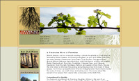
With their focus on all things artisanal, it’s nice to see the new site that more accurately reflects the beauty of their operation. The design is clean, visually appealing and the navigation reasonably simple. I also like the subtle, effective use of flash throughout the site. It’s well done and not overdone.
That doesn’t mean that the Web guru in me doesn’t see several shortcomings, some of which are Internet Design 101 issues:
- Take a look at the site in Internet Explorer, and you’ll see all of the design elements that were intended. But, look at it in my browser of choice, FireFox, and the site looks completely different. The discrepancy between browsers isn’t as bad as it could be, but in 2007, agencies shouldn’t only be designing for IE. In my experience, issues with FireFox are the result of messy code. IE is much more forgiving than FF. (Note: I alerted the winery to this issue and it has been fixed)
- The banner on the site, while beautiful, is way too large. Even on my high-resolution monitor, it takes more than 50% of the browser window, leaving less than 50% for the actual site content. This could have been fixed easily by reorganizing the navigation so that it wasn’t four deep and adding secondary navigation (which is used in places on the site anyway).
- The usability, as it relates to page length, is ludicrous on a few pages as well. Check out the "Our Wines" page and you’ll see what I mean. That is one long page. Wouldn’t it have been almost as easy to at least do one page for each of the main categories: Whites, Pinks and Reds? This was a big problem on the old site as well.
- It would also improve the usability if they "Home" link were put on the CDW logo in the upper left. That’s pretty much a standard these days. Burying "Home" in the lower right navigation isn’t great.
- Looking at the code, I don’t see any meta keywords on any of the pages and the few pages that do have meta descriptions, they are all the same one that seems to go with the events page. That’s not going to help search engines much, is it?
- And the biggest issue: the Wine Club form, which captures credit card information, is not secure. Not good. (Note: I alerted the winery to this issue and it has been fixed)
Despite these issues, the new site is definitely a move in the right direction. And that’s the most important thing for wineries to remember–as long as you’re getting better, it’s better than standing still. Still, these are pretty basic things that would have been easy to fix.
My guess? The agency that built the site, which does great design work and designs some great wine labels, just doesn’t have the Web experience it should for projects like this. Far too many agencies are building sites without basic understanding of the technology and user experience.